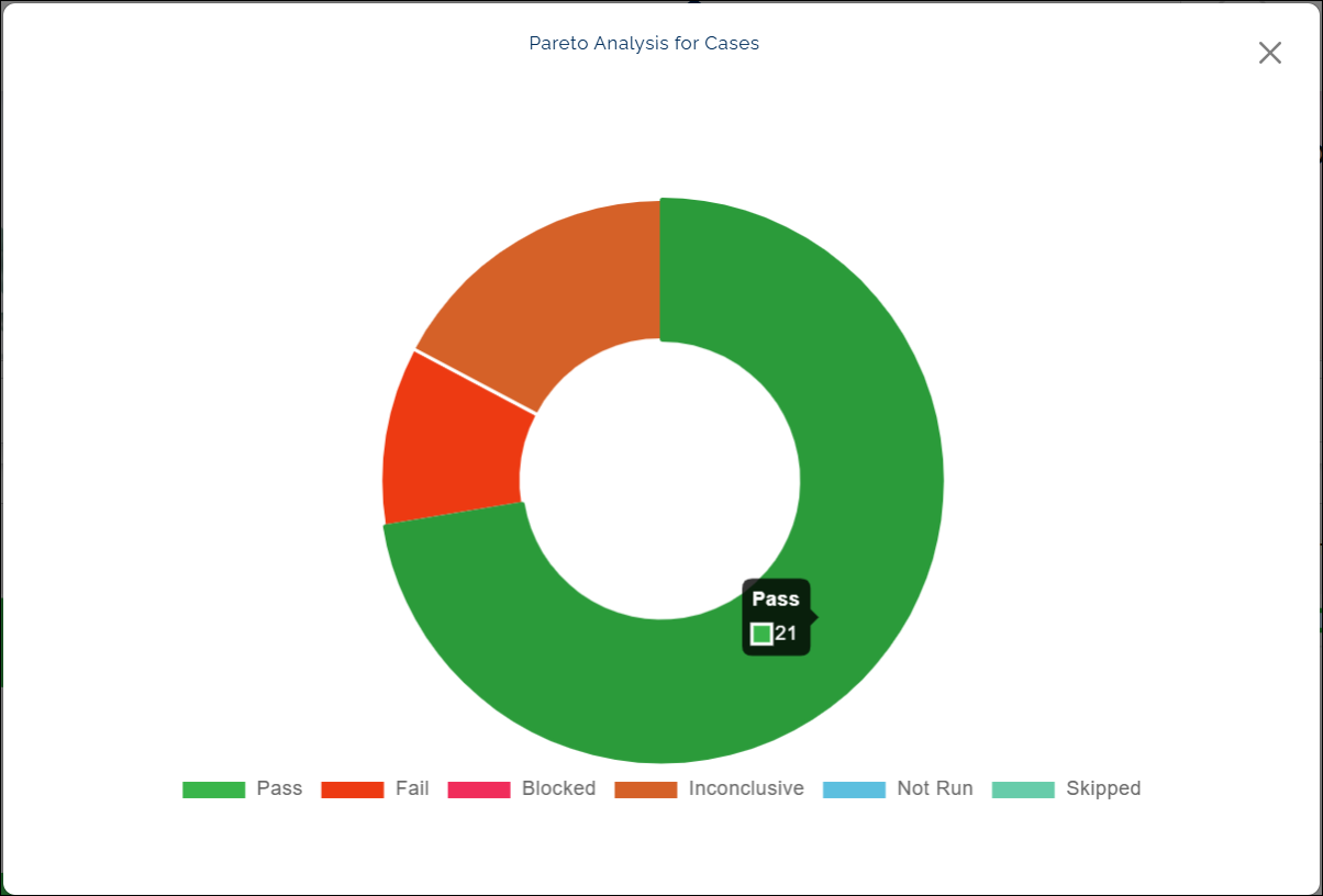
Pareto Analysis for Cases
What this chart shows:
- The Pareto Analysis for Cases chart displays the outcome of your automation runs, categorized by status: Passed, Failed, Blocked, Inconclusive, Not Run, and Skipped.
- Each status is represented by a distinct color to make comparison easy at a glance.
Why it matters:
- This chart provides a quick overview of your testing health.
- A higher number of passed cases indicates stable automation, while failed or blocked cases point to areas that may require review or fixes.
- By comparing different result categories, you can identify trends and focus on improving reliability where it matters most.
How to use it:
After you open the chart:
- Hover over any bar or section to see detailed counts and percentages.
Example view:
Click a color below the chart (for example, red for Fail) to temporarily hide that result type from the chart. The label appears struck through, and the chart updates instantly.
Last updated: Oct 14, 2025