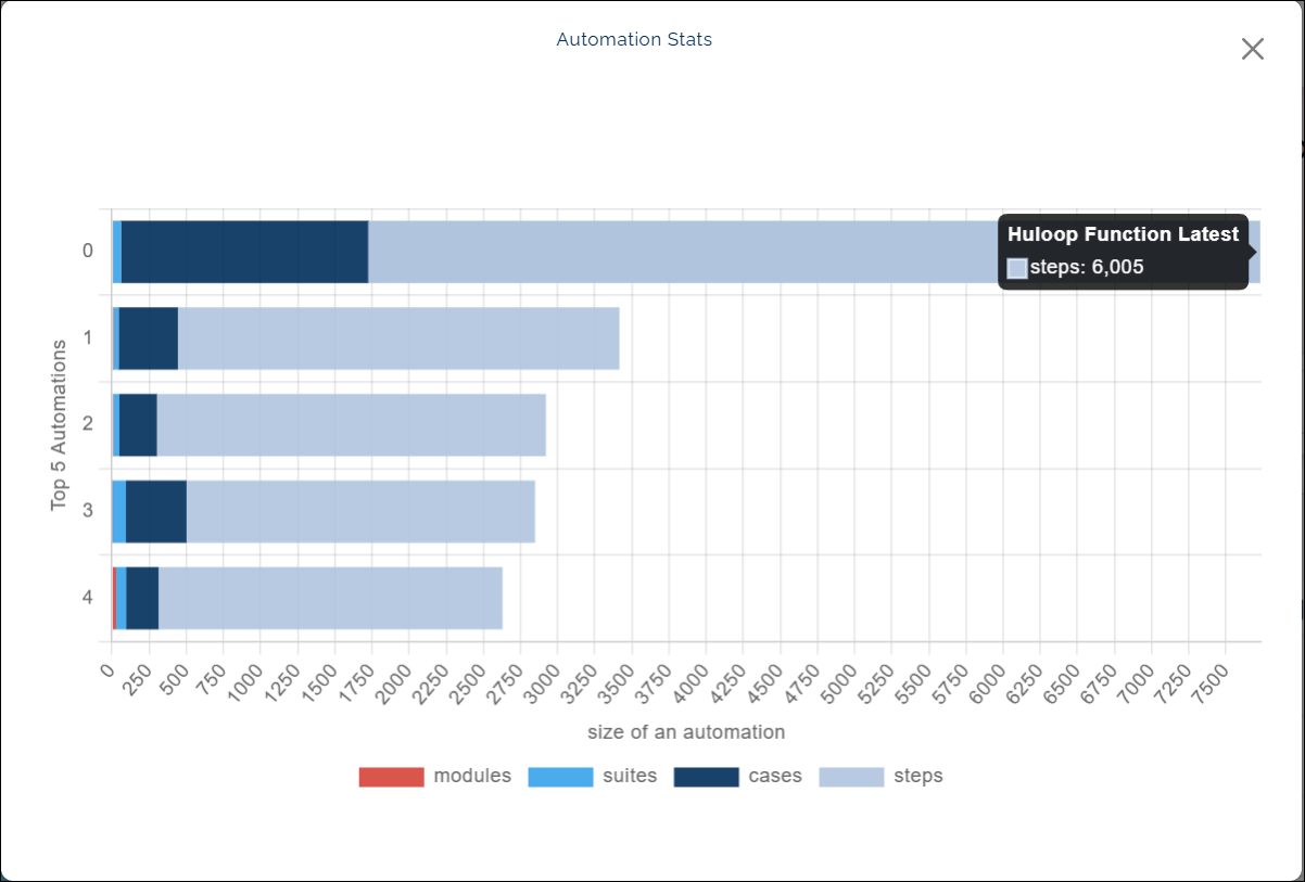
Automation Stats
What this chart shows
- The Automation Stats chart displays the top five automations based on the highest number of test steps.
- Each bar represents one automation and is divided into color-coded sections for Modules, Suites, Cases, and Steps.
- The overall bar size reflects the total number of components in that automation.
When you hover over a color segment, the chart shows:
- The name of the automation, and
- The count for that specific component type (for example, number of steps or cases).
Note: This chart is not affected by the project filter. It always displays data for the top five automations with the most test steps.
Why it matters
- This chart helps you understand the structure and scale of your most active automations.
- It provides a quick comparison of how different automations are built, showing which ones have the most modules, suites, or steps.
- You can use this insight to assess where your automation work is most extensive and plan future coverage accordingly.
How to use it
- Hover over any colored section of a bar to view the automation name and component count.
- Compare bar sizes and colors to identify how each automation is structured.
Example view: