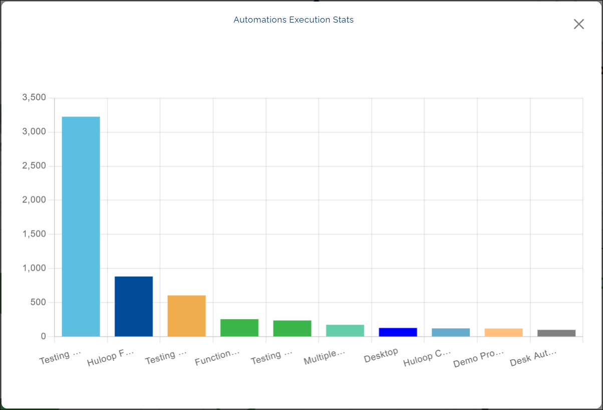
Automation Execution Stats
What this chart shows
- The Automation Execution Stats chart displays how many times each automation has been executed within a selected date range.
- Each bar represents an automation, and every bar is shown in a distinct color to help you differentiate them easily.
When you hover over a bar, the chart shows:
- The name of the automation, and
- The number of times it has been executed during the selected period.
Why it matters
- This chart helps you identify which automations are most frequently executed.
- Frequent execution often indicates active maintenance, continuous testing, or high business importance.
- Less active automations might need review to confirm they’re still relevant or up to date.
How to use it
- Hover over a bar to view the automation name and its execution count.
- Compare the bar heights to see which automations are run most often.
Example view: