Duration Over Time
What this chart shows
- The Duration Over Time chart shows how long automations and modules took to run over a selected period.
- It appears as a single line with several points marking each recorded run.
- When you hover over a point, a pop-up appears showing the time taken for both the automation and the module on that date.
Why it matters
- This chart helps you understand how execution time changes over time.
- You can use it to see whether runs are taking longer or becoming faster, and identify patterns that may affect performance or efficiency.
How to use it
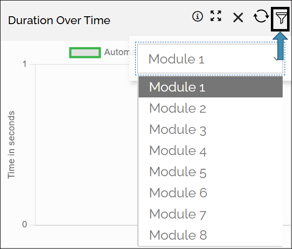
- Select the Module using the Filter icon
- Hover over any point to see the time for both automation and module on that date.
- Follow the line to observe how the duration changes across different dates.
Example view:
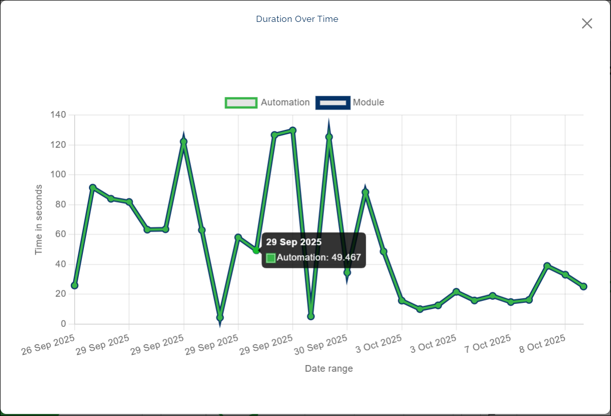
Click a label (Automation/ Module) to temporarily hide that result type from the chart. The label appears struck through, and the chart updates instantly.
Last updated: Oct 14, 2025