Runtime by User by Automation
What this chart shows
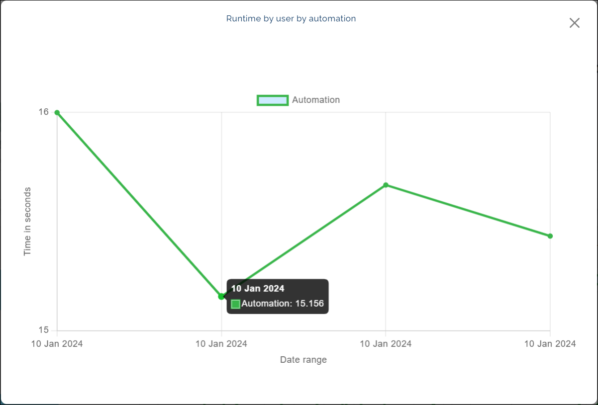
The Runtime by User by Automation chart shows the total time automations take to run for each user within a selected project and date range.
It appears as a line chart, with points plotted to represent runtime for specific dates.
- The bottom of the chart shows the dates for the selected period.
- The side of the chart shows runtime in seconds.
When you hover over a point on the chart, a pop-up appears showing the date and runtime for that automation.
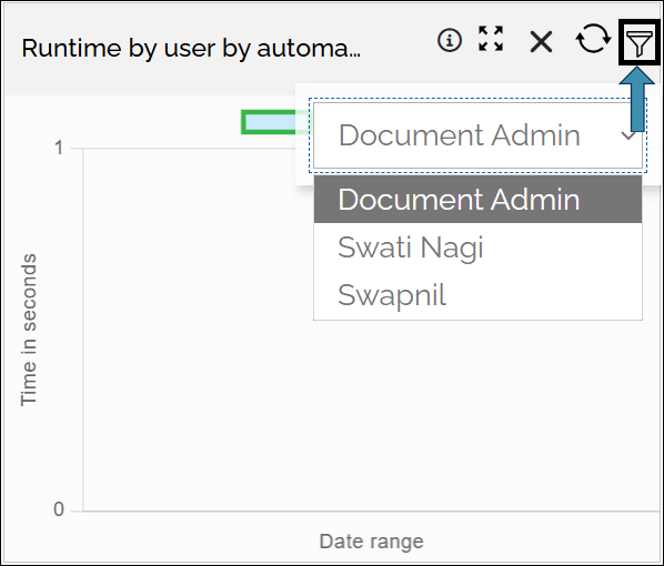
You can also use the User filter to view results for a specific user.
Why it matters
This chart helps you track how automation runtime changes over time for different users.
By reviewing these trends, teams can:
- See which users or automations take the most time.
- Spot changes in performance over time.
- Improve automation efficiency and plan resources better.
How to use it
- Use the User filter to view results for a specific user.
- Hover over any point on the line to see the date and runtime.
- Compare lines to spot differences in performance.
- Change the date range or project filter to focus on different time periods or projects.
Example view: