ROI-Cumulative Savings
What this chart shows
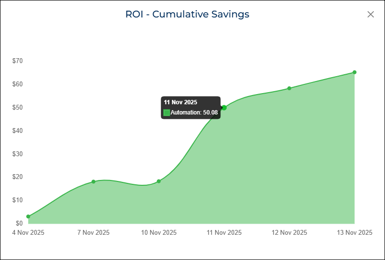
The ROI-Cumulative Savings chart shows how much total cost savings your automation has generated over a selected date range.
It adds up the savings over time, so you can see how the value grows with each run.
The chart appears as an area graph, with each point representing a time bucket (day, week, or month). The savings at each point include all savings accumulated up to that date.
When you hover over any point, the chart shows:
- The date
- The cumulative cost savings in dollars
Why it matters
This chart helps you understand the long-term impact of your automation.
As your automation continues to run, the chart shows how much cost you avoided compared to doing the same work manually.
You can use this chart to:
- Track ROI growth over time
- Show how automation contributes to operational efficiency
- Demonstrate value during audits, reporting, or stakeholder reviews
How to use it
- Select the Date Range from the dashboard filters.
- Select the Automation you want to review.
- The chart automatically updates to display cumulative savings.
- Hover over any point on the chart to view the cumulative savings for that date range.
- Follow the shaded area to see how savings increase over the selected period.
Example view