Cumulative Time per Automation
What this chart shows
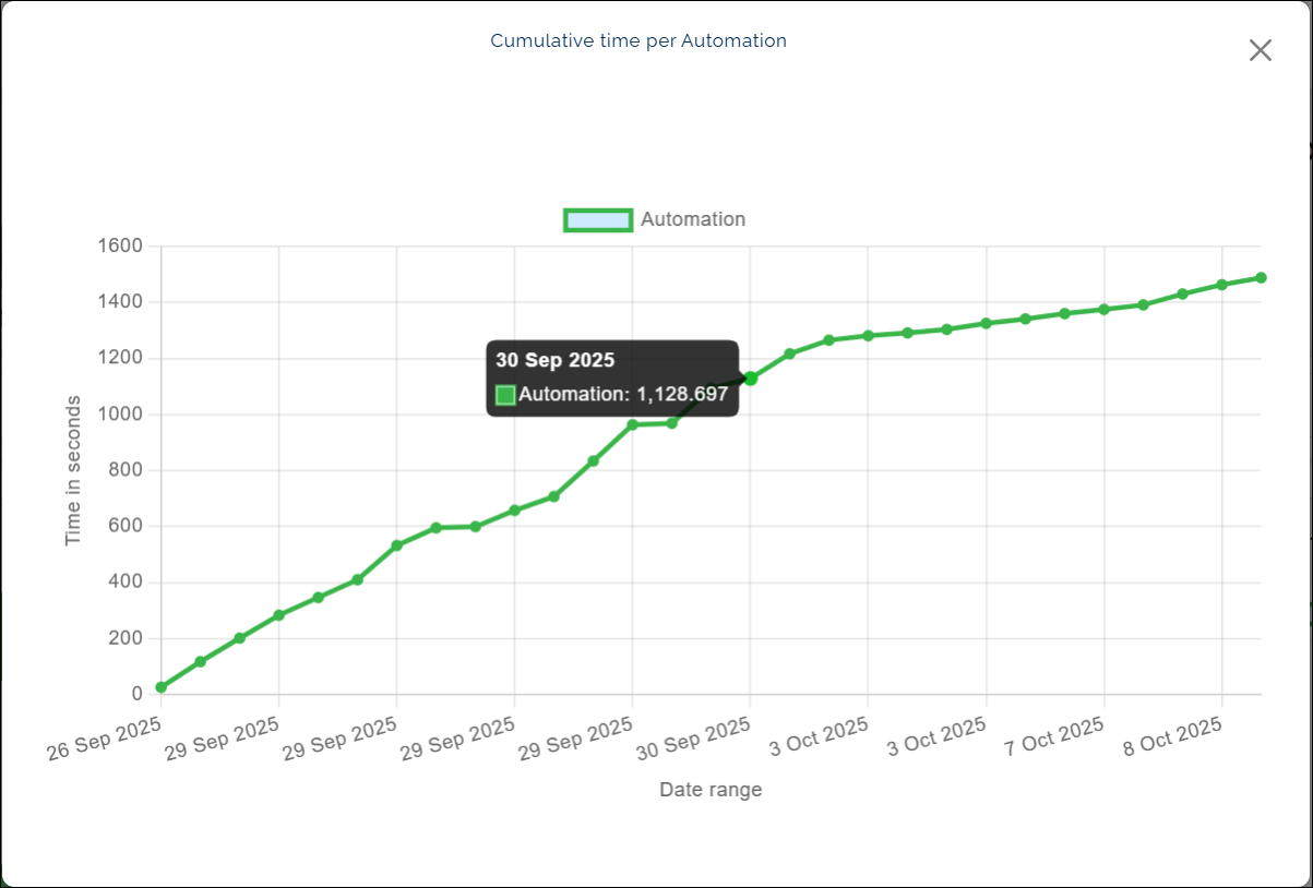
- The Cumulative Time per Automation chart shows how much total time your automation has taken to run over a selected period.
- It appears as a connecting line with several points, each point marking a recorded execution.
- If an automation runs more than once on the same day, the chart shows a separate point for each run.
- When you click a point, it displays the date and the total time taken in seconds.
Why it matters
- This chart helps you see how the total runtime changes over time.
- It can show if an automation is taking longer to complete or if it is being run more frequently on certain days.
- These trends can help you track performance and plan improvements.
How to use it
- Click any point on the chart to see the date and time in seconds.
- Follow the connecting line to understand how the total time builds up over multiple runs.
Example view: