Add and Configure Controls
Controls are used to collect input from the user when the app runs.
- Controls must be placed inside a column.
- You can add a control by dragging it from the Controls panel and dropping it inside a column on the design canvas.
- If you drag a control directly into a row without adding a column, a column is created automatically and the control is placed inside it.
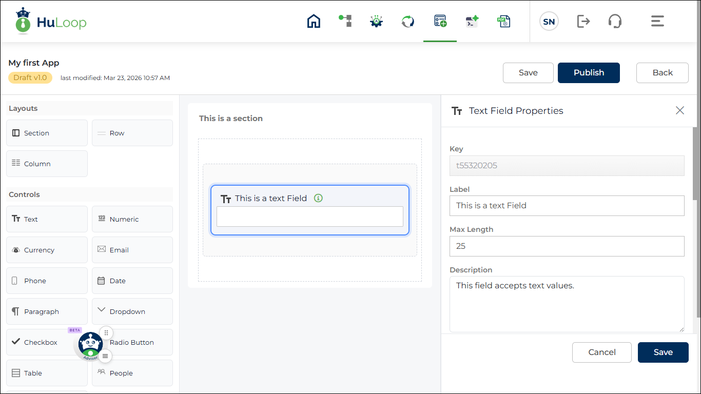
- When a control is added, the properties panel opens on the right side of the screen.
- You can configure the control properties from this panel.
- The available properties may change depending on the type of control that you select.
- Different control types are explained in the next section.
- After adding the control, update the required properties and save the changes if needed.
- Different controls may have different properties, but the basic steps to add and configure a control are similar. The next section explains how to add and configure a Text control.
Steps to add a Text type control:
- Drag Text control and drop inside column (if you drop it inside a section/ row, a row and a column will be automatically added)
- Configure properties:
- Key: Mandatory, auto-generated and must be unique.
This value is used internally to identify the field and is also used in rules and mappings. - Label: Text shown as the field name in the app.
This helps the user understand what value needs to be entered. - Maximum Length: Maximum number of characters allowed in the field.
Use this to restrict the input size. - Description: Maximum number of characters allowed in the field.
Use this to restrict the input size. - Is Required: Controls whether the field is mandatory.
- ON: The user must enter a value before submitting the app.
- OFF: The field is optional.
- Placeholder: Text shown inside the field before the user enters a value.
This helps the user understand what to enter.
Example: Enter name
- Default Value: Sets a value that is already filled in when the app opens.
The user can change this value if the field is editable. - Allow Multi-Line
- ON: Allows the user to enter multiple lines of text.
- OFF: Allows only a single line of text.
- Allow Masking
- ON: Hides the entered text. Useful for sensitive information such as passwords.
- OFF: Text remains visible.
- Is Read Only
- ON: The field cannot be edited by the user.
- OFF: The field cannot be edited by the user.
- Text Casing: Controls how the entered text appears.
- Normal: Text appears as entered.
- Uppercase: All text is converted to uppercase.
- Lowercase: All text is converted to lowercase.
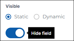
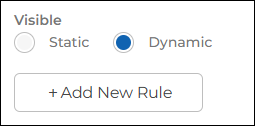
- Visible: Controls whether the field is shown in the app. You must first select the visibility type.
- Static: The field visibility is controlled manually. When Static is selected, a Visible toggle appears.
- ON: The field is shown in the app.
- OFF: The field is hidden in the app.
- Key: Mandatory, auto-generated and must be unique.
By default, the toggle is ON and the field is visible.
- Dynamic: The field visibility is controlled using rules. When Dynamic is selected, you must configure a rule. The field will be shown or hidden based on the rule condition. Use Dynamic visibility when the field should appear only for specific values or conditions. Click here to know more about the Rules.
Note: Additional fields properties may appear depending on control type.
Edit a Control
You can edit the properties of an existing control.
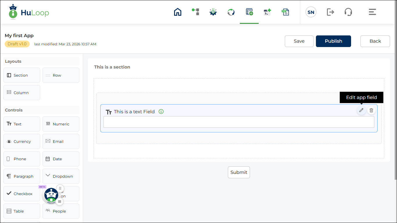
- On the design canvas, locate the control that you want to edit.
- Click the Edit icon on the control.
- The properties panel opens on the right side of the screen.
- Update the required settings in the properties panel.
- The available properties depend on the control type.
- After updating the properties, save the changes if required.
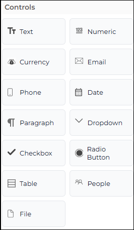
Control Types
Controls are used to collect input from the user when the app runs. You can drag a control from the Controls panel and place it inside a column. Each control is used for a different type of input.
The following control types are available.
- Text: Used to enter text values such as name or description.
- Numeric: Used to enter numbers.
- Currency: Used to enter currency values.
- Email: Used to enter an email address.
- Phone: Used to enter a phone number.
- Date: Used to select a date.
- Paragraph: Used to enter long text.
- Drop-down: Used to select one value from a list.
- Checkbox: Used to select one or more options.
- Radio Button: Used to select only one option from multiple choices.
- Table: Used to enter data in rows and columns.
- People: Used to select a user.
- File: Used to upload a file.