App Builder
After clicking Save and Continue, the App Builder opens.
This is where you design your App by arranging layouts and adding input fields. You can build your app visually by dragging and dropping components onto the canvas.
Think of the App Builder as your workspace where you structure how your app looks and how users interact with it.
A Quick Example
Let’s say you want to create an Employee Onboarding app.
In the App Builder, you can:
- Add sections like Personal Details, Job Information, and Documents
- Use fields like Text (for name), Date (for joining date), and File (for uploading documents)
- Arrange everything in a clean, easy-to-follow layout
Example App Name: Employee_Onboarding
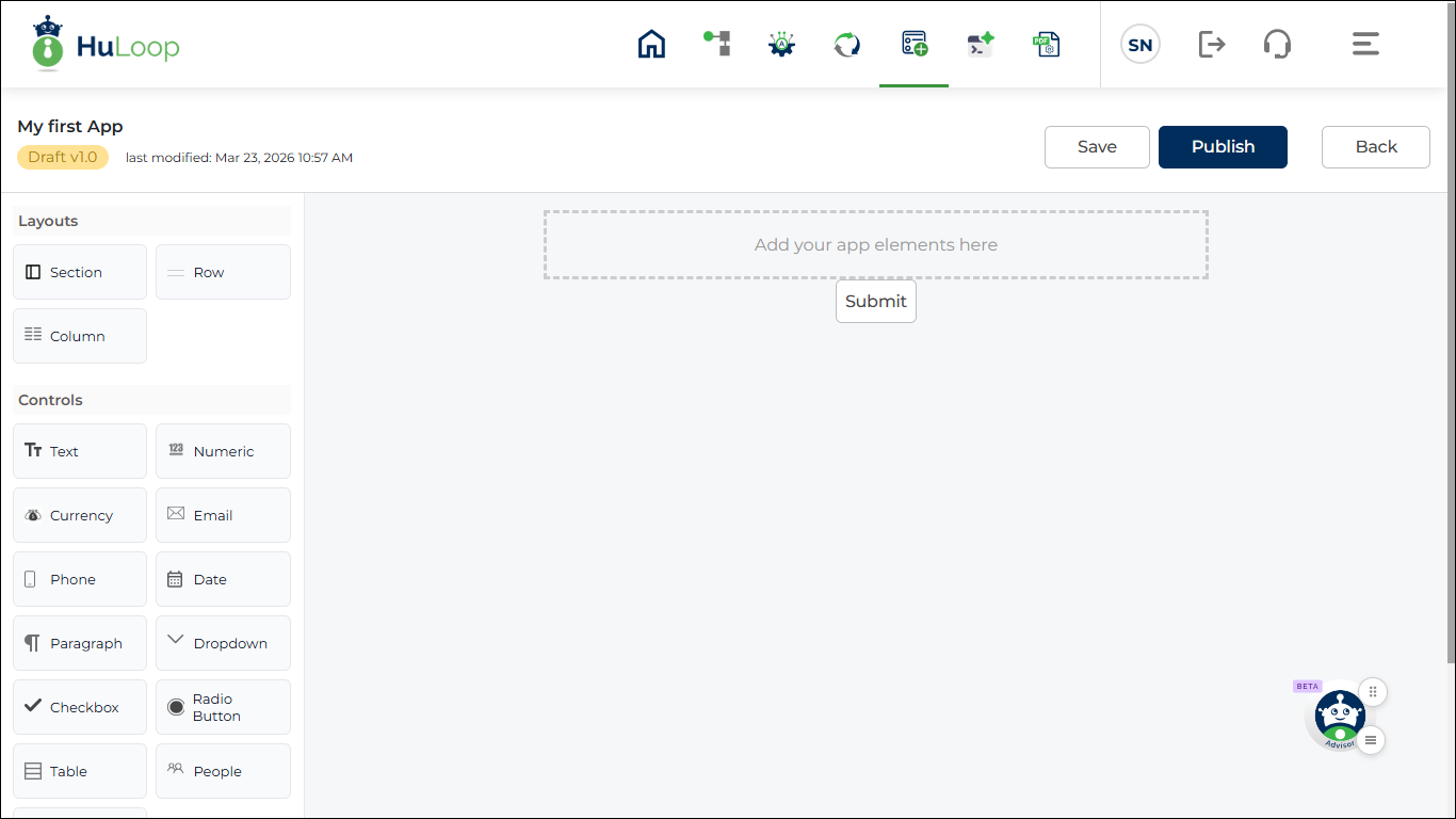
Key Areas in the App Builder
The App Builder screen is divided into three main areas that help you design your app.
- Layout and Control Panel
- Design Canvas
- Properties Panel (appears when you add a layout or control to the design canvas)
Layout and Control Panel:
Use this panel to select the building blocks of your app.
It contains two types of components:
- Layout Components
These help you structure your app.
- Section: Use this to group related fields together (for example, “Employee Details”)
- Row: Helps you arrange fields horizontally
- Column: Lets you divide a row into multiple sections
Start with a Section, then add Rows and Columns inside it to keep your app organized.
- Control Components
These are the actual input fields that users interact with.
These include:
- Text: For short text values.
- Numeric: For numbers.
- Currency: For monetary values.
- Email: For email addresses.
- Phone: For phone numbers.
- Date: For selecting dates.
- Paragraph: For longer text inputs.
- Drop-down: For selecting one value from a list.
- Checkbox: For selecting multiple options.
- Radio Button: For selecting one option.
- Table: For entering structured data in rows and columns.
- People: For selecting users.
- File: For uploading documents.
To use any component, simply drag and drop it onto the Design Canvas.
Design Canvas
The Design Canvas is the main area where you build your app.
This is where you:
- Arrange layouts (Sections, Rows, Columns)
- Add controls (input fields)
- Organize the overall structure of your app
Properties Panel
The Properties Panel appears when you select or edit any component on the canvas.
Use this panel to customize how each component behaves and appears.
You can configure:
- Section, Row, and Column settings
- Field labels and input types
- Default values and validations
- Rules and conditions

Designing Your App
Now that you understand the App Builder layout, you can start designing your app.
A good approach is to build your app step by step:
- Add a Section to define a logical group (for example, Employee Details)
- Insert Rows and Columns to structure the layout
- Drag and drop Controls to capture user input
- Configure each field using the Properties Panel
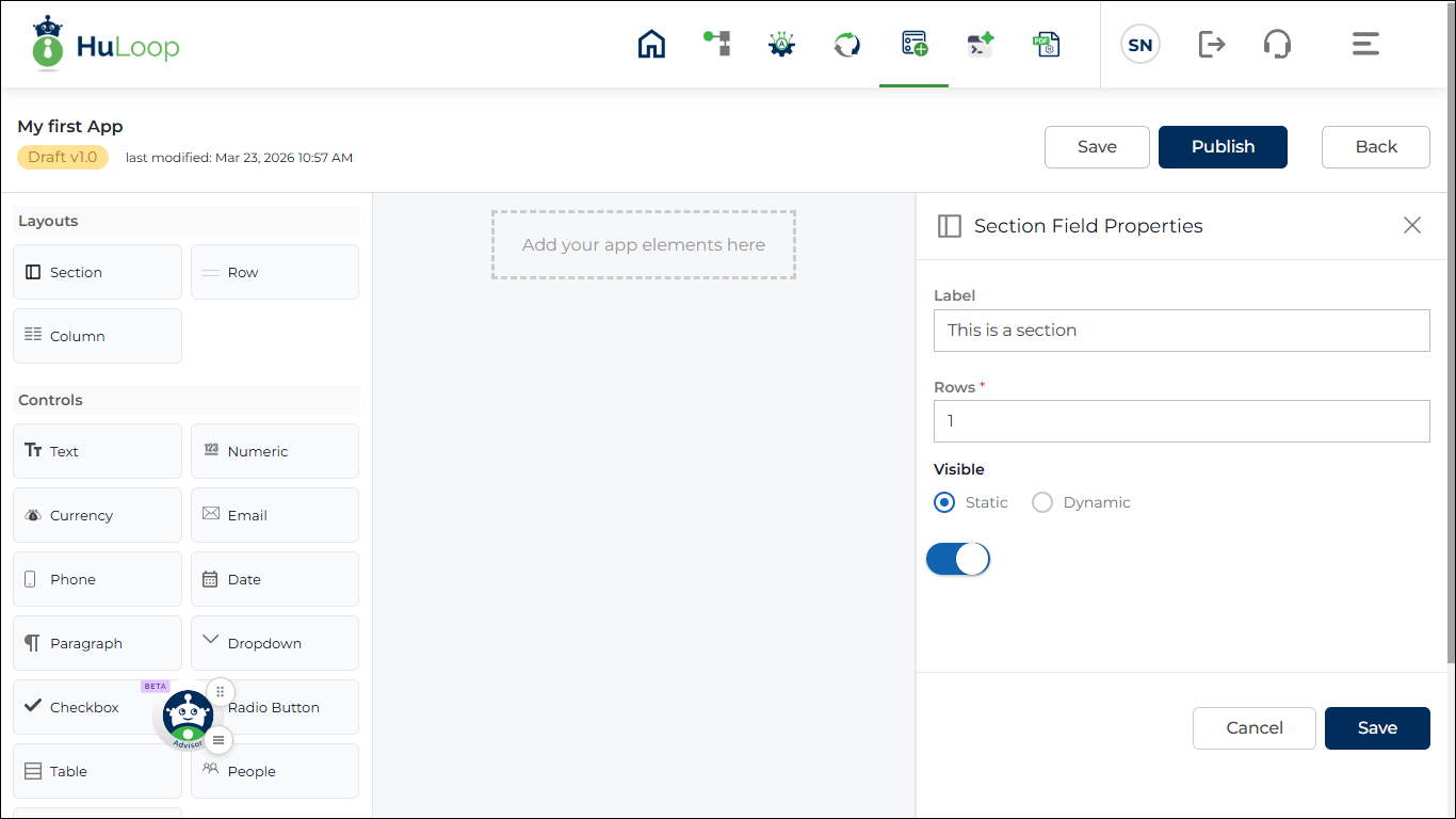
Add Section
A Section helps you group related fields together and improves the overall structure of your app.
To add a section:
- Drag and drop the Section component onto the Design Canvas
As soon as you add a section, the Properties Panel opens automatically so you can configure it.
By default, a new section includes:
- One row
- One column
You can modify this structure based on your needs.
Section Properties
Once a section is added, you can customize it using the Properties Panel.
- Label: Enter a label that clearly describes the type of information grouped within the section. You can enter up to 255 characters, and both letters and numbers are supported. You can also include commonly used special characters such as ~ ! @ # $ % ^ & * ( ) – _ + =.
- Number of Rows: Use this setting to define how many rows are included in the section.
A section always starts with one row by default, and at least one row is required. You can increase the number of rows depending on how many fields you want to organize within the section. - Visibility: Use this setting to control whether the section is shown to users.
You can choose between:- Static: Visibility remains fixed.
- Dynamic: Visibility is controlled using rules.
Note: Static / Dynamic is available for all components:
- Section
- Row
- Column
- Control
When Dynamic is selected:
- Visible toggle is not shown
- Rule configuration is required
Click +Add New Rule to configure rules.
Rule configuration is explained in the Rule Configuration section.